Auréle Beauty
Luxury SkinCare Branding
Project Overview
Auréle Beauty is a self-directed luxury skincare branding project focused on crafting a refined, modern, and timeless brand identity. The goal was to design a cohesive visual system that reflects premium quality, elegance, and sophistication while appealing to a high-end beauty market.
This project explores how strategic branding, typography, and visual storytelling can elevate a skincare brand and position it within the luxury beauty space.
Programs Used
Adobe Illustrator
Adobe Photoshop
Canva Pro
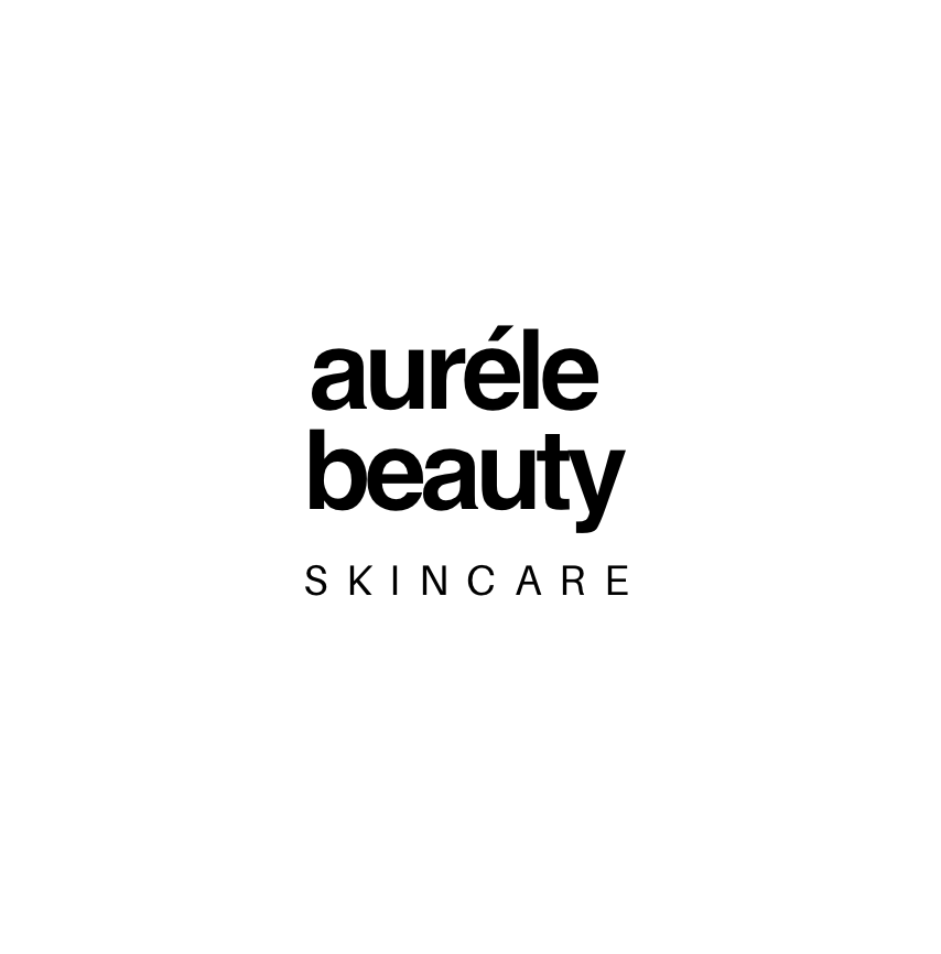
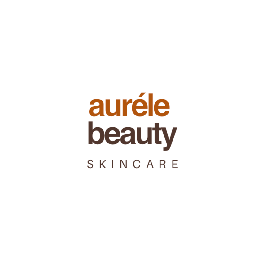
Logo 1:
Auréle Beauty Process…
Deliverables
Logo with supporting brand elements
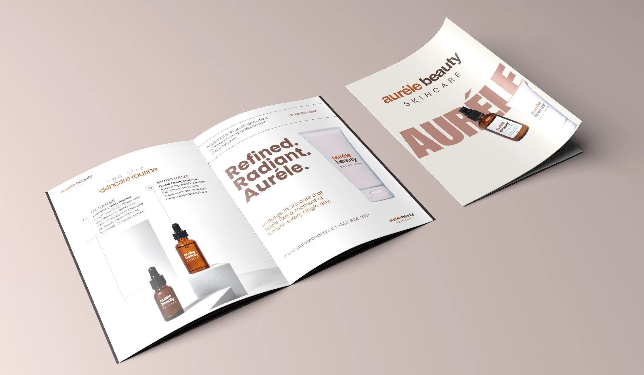
Product and package design
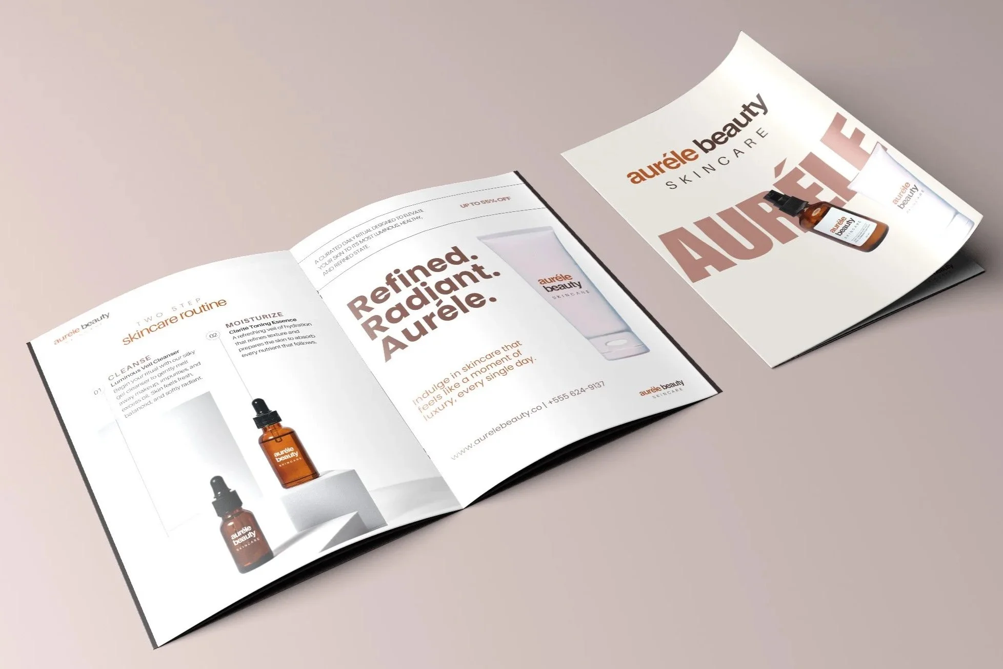
Four Magazine Ads
Product Catalog Booklet
Objectives
Create a sophisticated luxury skincare brand identity
Develop a cohesive visual system across multiple brand touchpoints
Communicate elegance, trust, and modern beauty through design
Design packaging and editorial layouts that feel elevated and timeless
Brand Concept
Auréle Beauty is inspired by the idea of understated luxury—where beauty is effortless, refined, and intentional. The brand balances softness and structure, combining modern minimalism with classic elegance to create a calm yet premium aesthetic.
The identity was designed to feel aspirational without being inaccessible, appealing to consumers who value both luxury and self-care.
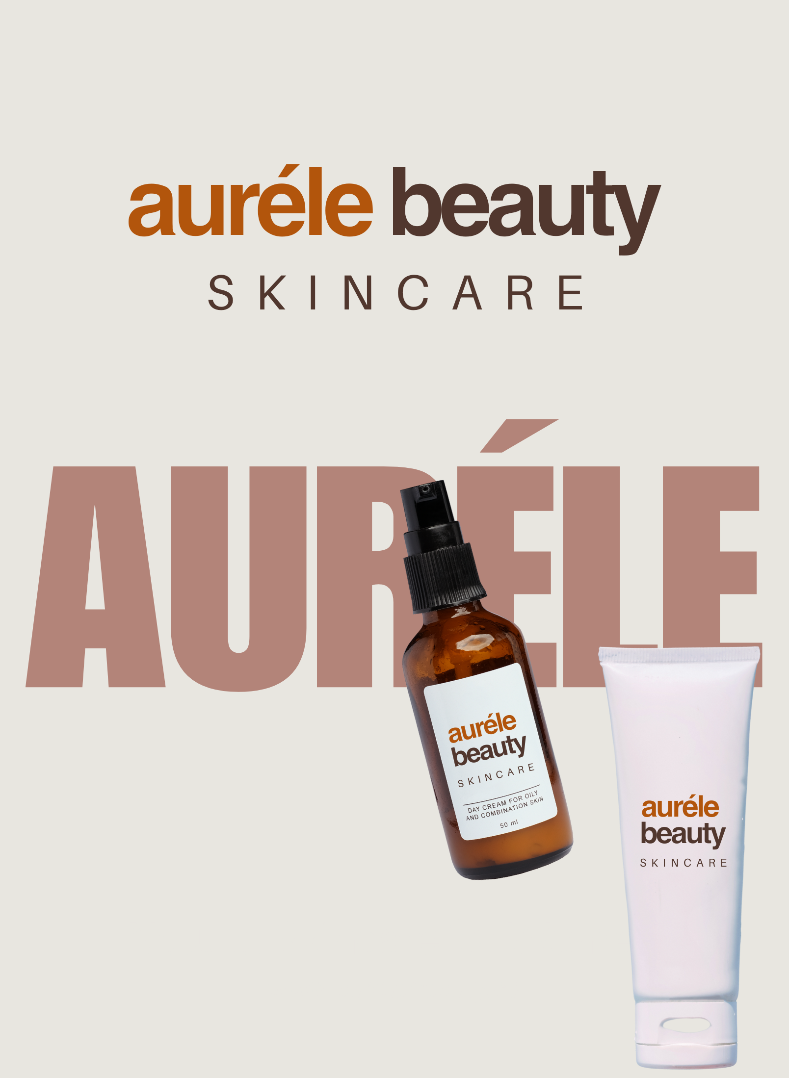
Logo & Brand Elements
Made in Adobe Illustrator
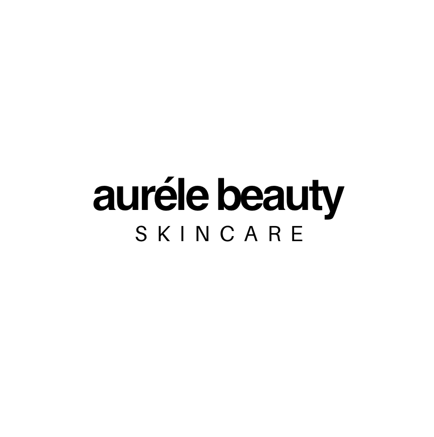
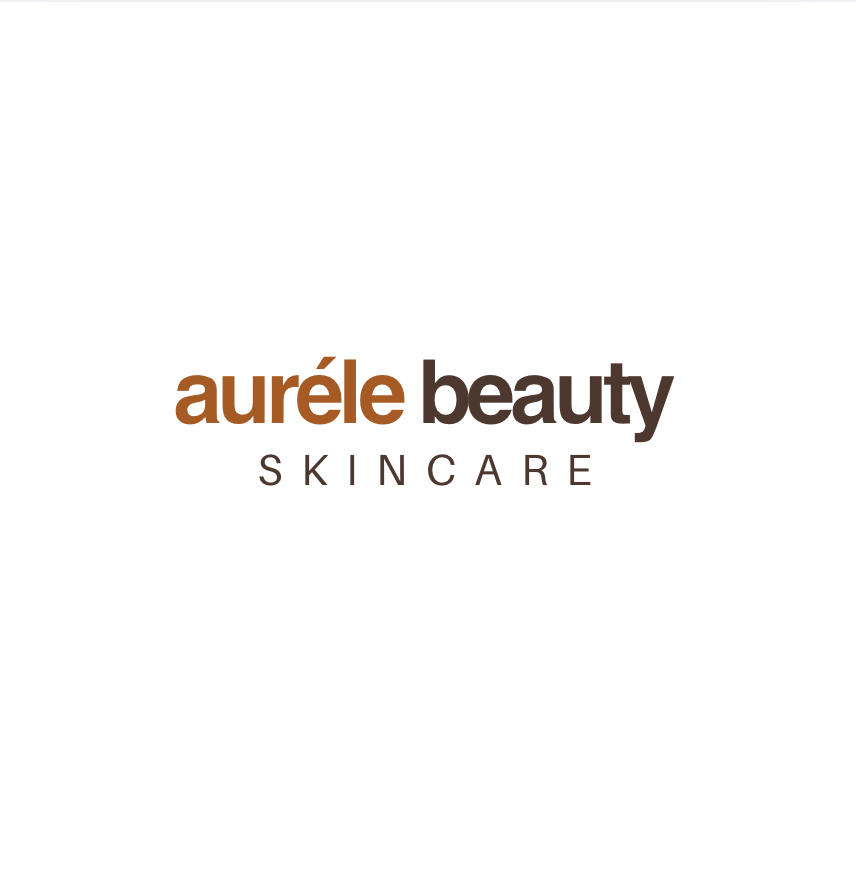
Logo 2:
Logo Variations
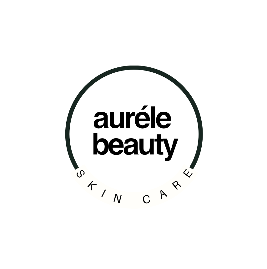
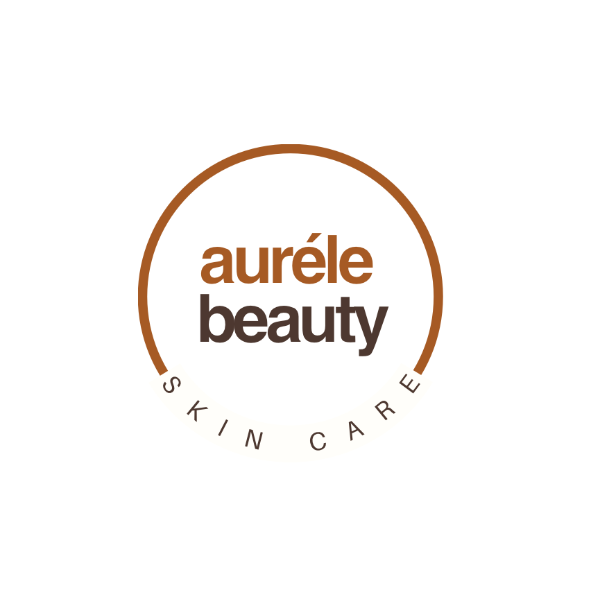
Three logo iterations were developed using the same typeface pairing to explore versatility through composition rather than font changes. Each variation experiments with hierarchy, spacing, and structure—ranging from a stacked wordmark to a linear layout and a circular lockup. This approach ensures visual consistency across brand touchpoints while allowing flexibility for different applications such as packaging, editorial layouts, and digital use.
Logo System Exploration
Using consistent font pairings, three logo compositions were created to explore hierarchy and layout flexibility. These variations allow the brand to adapt seamlessly across different formats while maintaining a cohesive and recognizable identity.
Final Logos
Visual Identity
Logo 3:
Typography
A refined serif typeface was selected to communicate luxury, heritage, and sophistication, paired with a clean sans-serif to maintain modern balance and readability across applications.
Design System
A clean and consistent layout system was developed to ensure cohesion across packaging, marketing materials, and digital applications. Generous spacing and minimal compositions allow the brand to feel elevated and intentional.
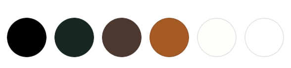
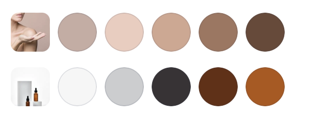
Color Palette
The palette features soft neutrals and warm tones, creating a sense of calm, elegance, and purity. These tones support the brand’s skincare focus while reinforcing a premium, editorial feel.
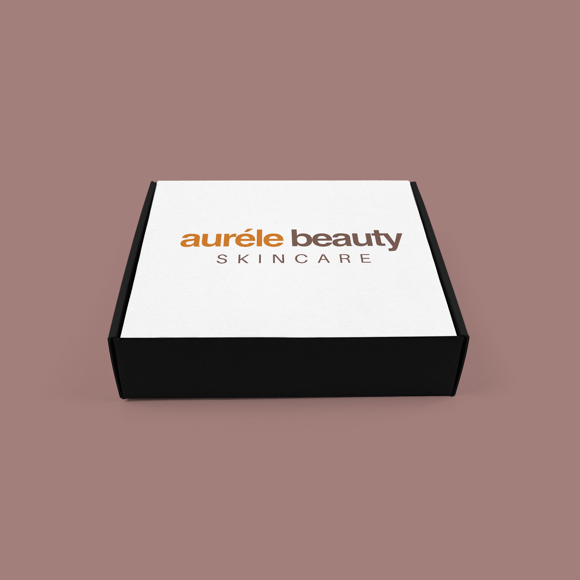
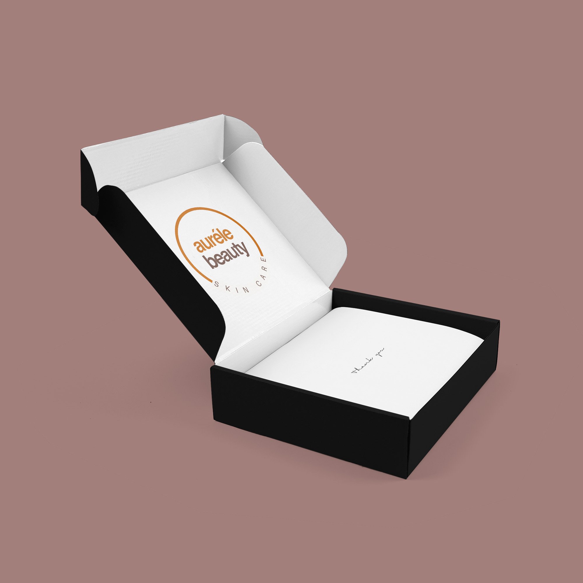
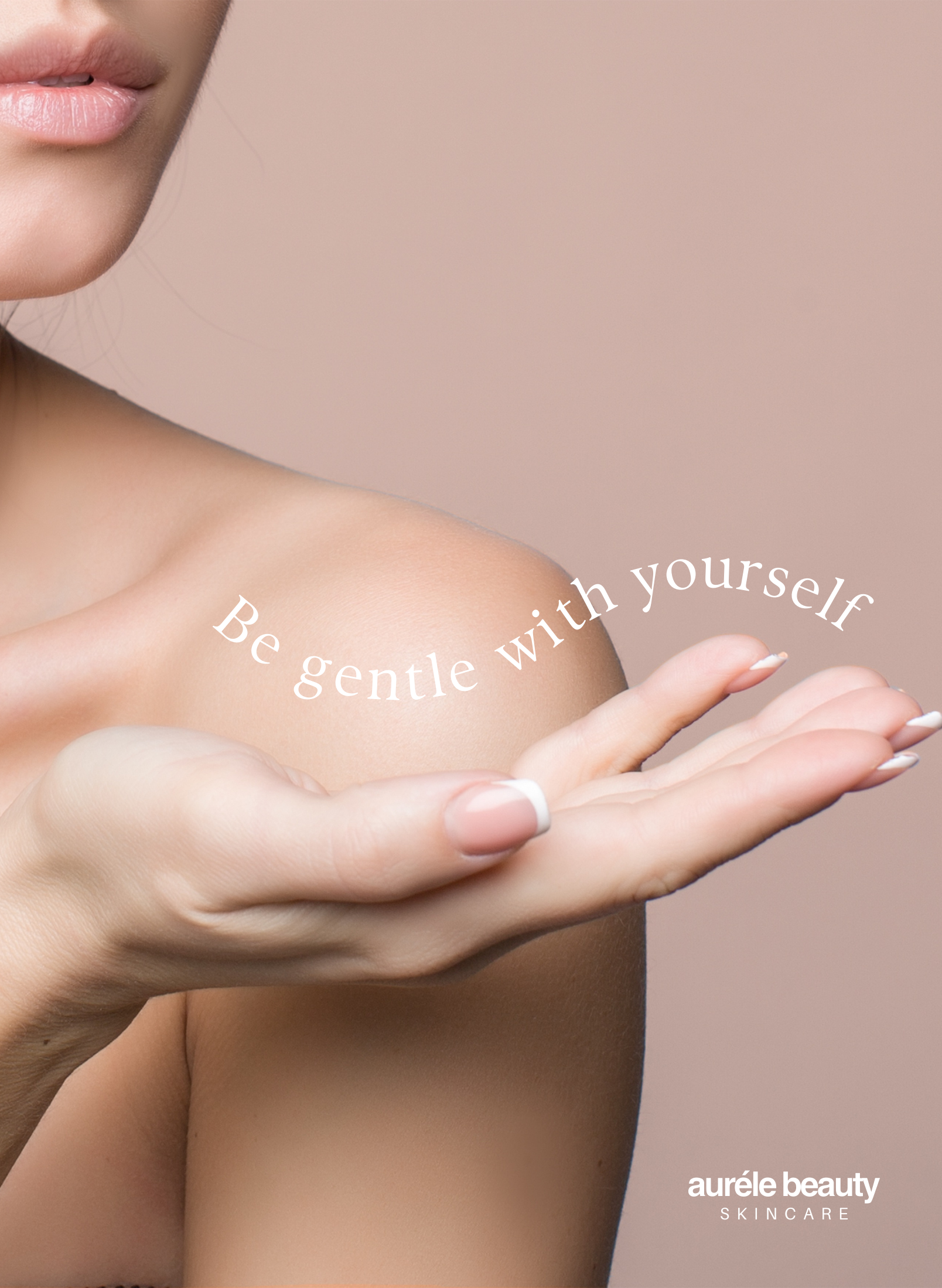
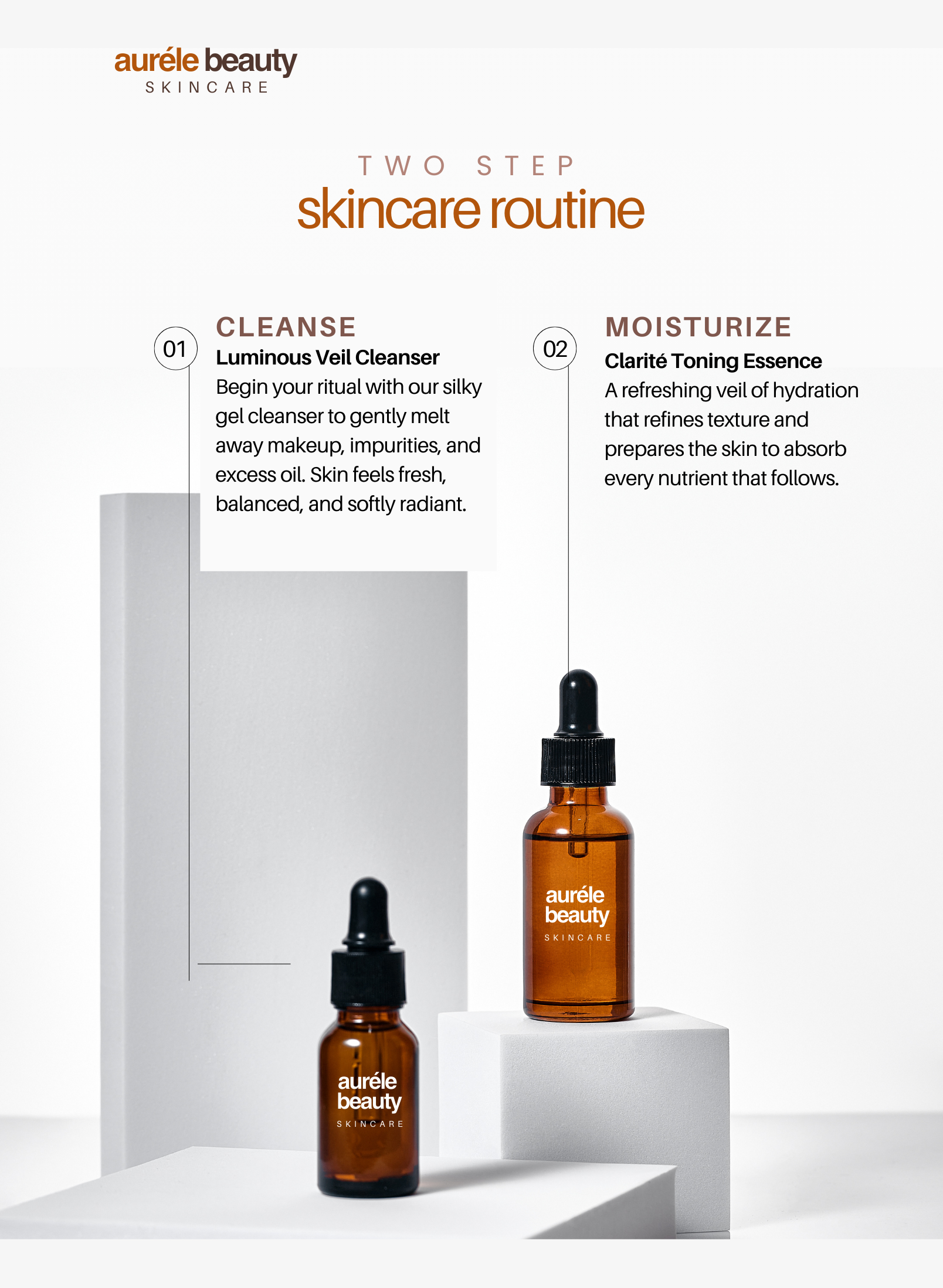
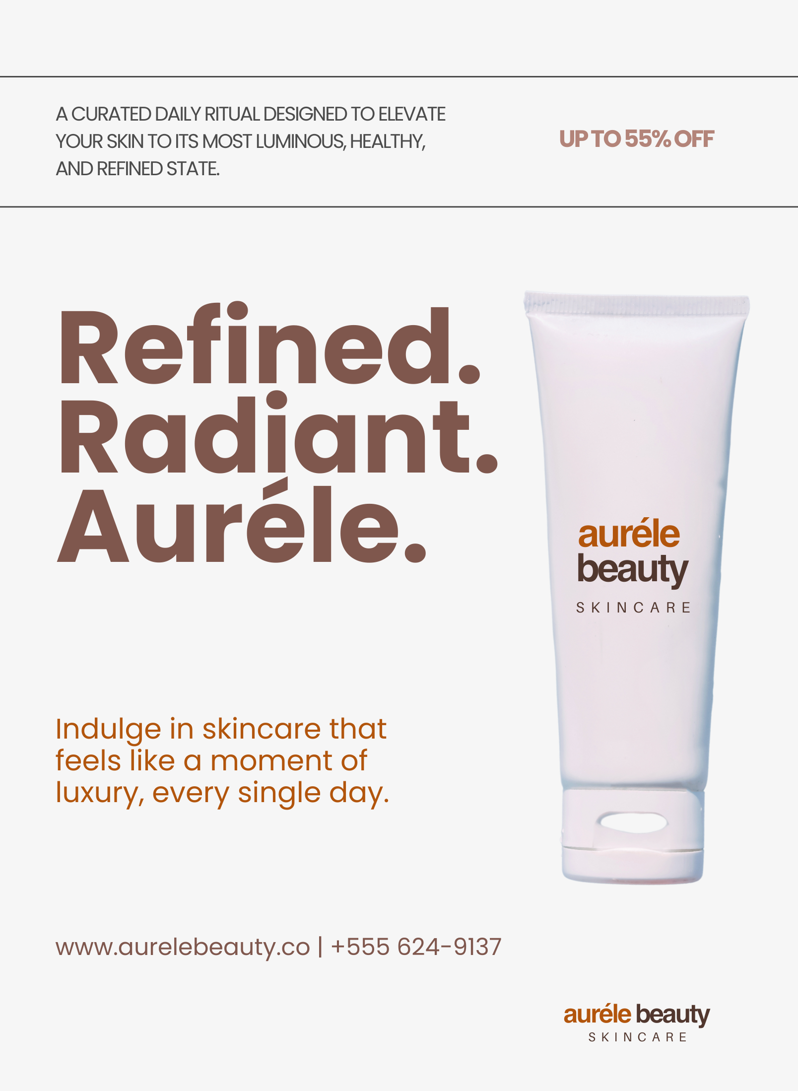
Packaging Design
Packaging concepts emphasize simplicity and luxury. Minimal typography, subtle detailing, and refined layouts were used to create a premium shelf presence. Each package design was approached with a focus on clarity, elegance, and brand consistency.
Final Product Packaging Design & Magazine
Final Thoughts
This project strengthened my understanding of how intentional branding decisions shape a luxury experience. Through developing Auréle Beauty, I learned how to balance minimalism with sophistication, ensuring every design choice from typography to layout felt purposeful and aligned with the brand’s identity. Consistency, restraint, and attention to detail are key to building trust and emotional connection with the consumer.